This week I made a painting of the Peverell Brothers.


Now to get painting!
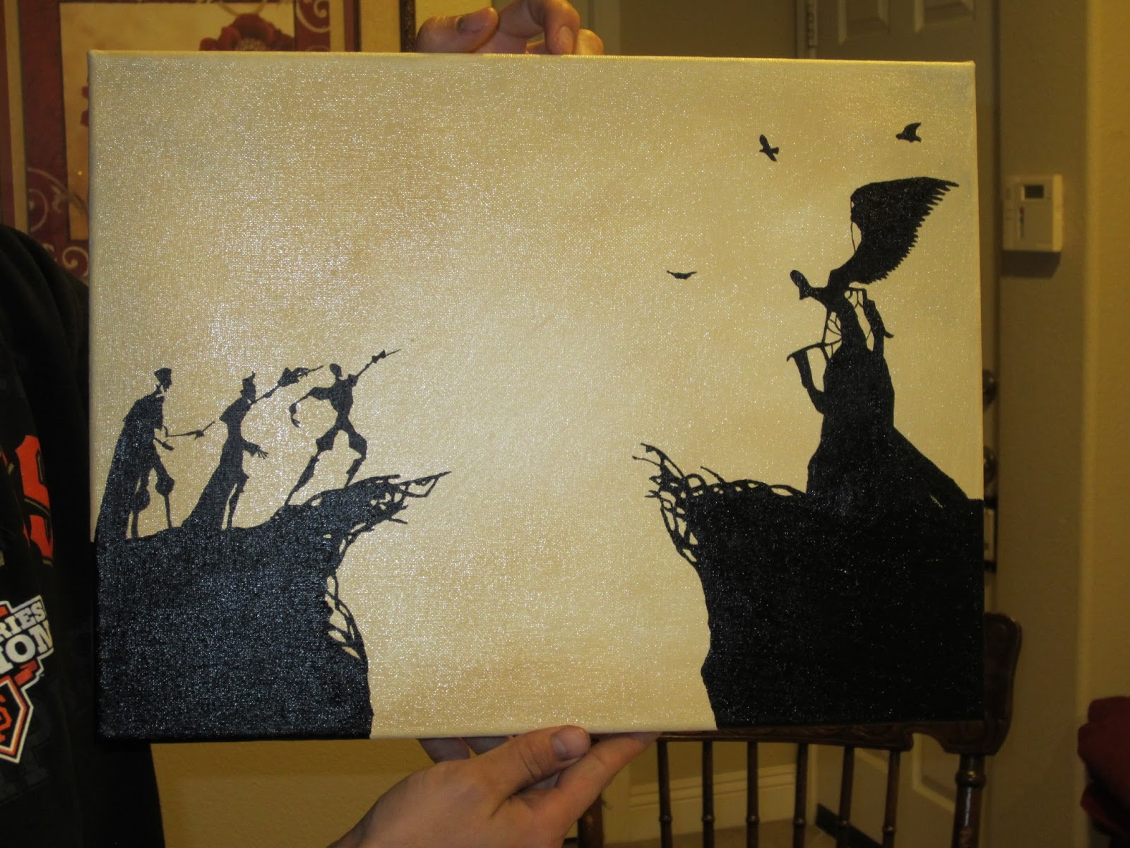
I used a 12"x16" canvas. I decided to use oil paint because I've used the cheap-o acrylic paints you can buy for 50 cents a piece, and whenever I use black it tends to turn dark gray. I wanted a really saturated black, and I knew oil paints would do a better job of that.


For anyone unfamiliar with the tale, the Peverell Brothers are ancestors of Harry Potter. This painting is mimicking the animation in the 7th Harry Potter movie. Here is the animation:
I, as always, did not come up with the idea myself, but copied someone else. The person I copied had posted their painting to the internet, but it only had 2 brothers in it. They painted with black paint on a white canvas, and it looked to me like they tried to make the background have gently black streaks on it.

The animation has more of a sepia background, so I took the image the other person posted and edited in in a online photo editing website to have a sepia-ish overlay.

I decided I liked it a lot better, so I tried to copy that. Also, it really bugged me that there was only 2 brothers instead of 3. After some intense googling, I found a picture that I think this painting was based off of.

This picture has the third brother, and that's what I used to paint my third brother.
I started by taking the original picture of the painting and pasting it into a Word document I made the picture 12" tall because the canvas I bought is 12" tall. This made it so my painting would end up with the same porportions as the original. The brothers ended up being about 3" tall. I also took the picture that has all 3 brothers and cropped it so it only focused on the brother in the background. Then I printed everything out on paper.

Now to get painting!
I used a 12"x16" canvas. I decided to use oil paint because I've used the cheap-o acrylic paints you can buy for 50 cents a piece, and whenever I use black it tends to turn dark gray. I wanted a really saturated black, and I knew oil paints would do a better job of that.

I've done Bob Ross paintings before, and he always preps his canvas with Liquid White. Liquid white is just 50% white oil paint and 50% linseed oil. It helps when you are blending in background colors. I accidentally did a 2:1 ratio of oil to paint, which was fine but it made it so my background color took 5+ days to fully dry.
After painting with the white paint/oil mixture, I used a mixture of Burnt Umber and Yellow Ochre to get my background color.

I colored more heavily towards the edges, and left the center a little lighter. I tried to not make it very even, because I like the uneven look. I also VERY sparingly used some black around the edges. (Make sure you paint around all the sides, too!)


You can't even really see the black, I used so little of it.
After that was finally dry, I got to painting the brothers and Death.
I started by cutting out the stencils I was using and figuring out where on the canvas I wanted them to go.

I don't know how to rotate this image.

I marked the edge of the canvas with pencil where the page ended.
I taped all the pieces of paper together, and then taped them to the back side of the canvas, lining the page up with my pencil markings.

I had to move the first brother closer to the edge of the cliff in order to fit all three brothers on the painting.


Where the paper hits the wood frame, I just folded it up along the wood.

For me to copy the silhouette, I needed light from the back side. I propped my canvas up on some cups, and then put my cell phone underneath with the flashlight facing upwards.


It doesn't illuminate everything at once, but I just kept moving my cellphone around so it shined on the part I was working on. Turning off the lights helps you to see better, too.


I used the purple brush mostly because it could pain the thinnest lines (for the brothers' arms).

The last brother partially was behind the wood frame, so I couldn't trace him. I just had to reference the picture (sitting right next to me) and try my best.


David helped me paint in the large areas of black.
We painted the sides of the canvas, too, so that it still looks complete even if we don't have a frame for it.
Wet

Wet

Wet

Dry

Dry
The background is a little bit shiny, but the black is almost matte. It doesn't look quite as yellow when I put it next to beige carpet and wall, but I love how it turned out!
No comments:
Post a Comment